Role
Product Designer
Company
Arka Control Sharif
Year
2023
Arka Control — Simplifying Complex Control Systems

Turning Complexity into Clarity
Arka Control is a UX/UI case study focused on reimagining how complex control systems can be transformed into a more understandable and usable digital experience. The project starts from a common problem in operational and control-based tools: interfaces that are powerful but overwhelming, where users are forced to deal with dense information structures, unclear navigation, and high cognitive load. This case study explores how thoughtful UX design, information hierarchy, and interface simplification can reshape such systems into something more intuitive, readable, and efficient without losing functional depth.
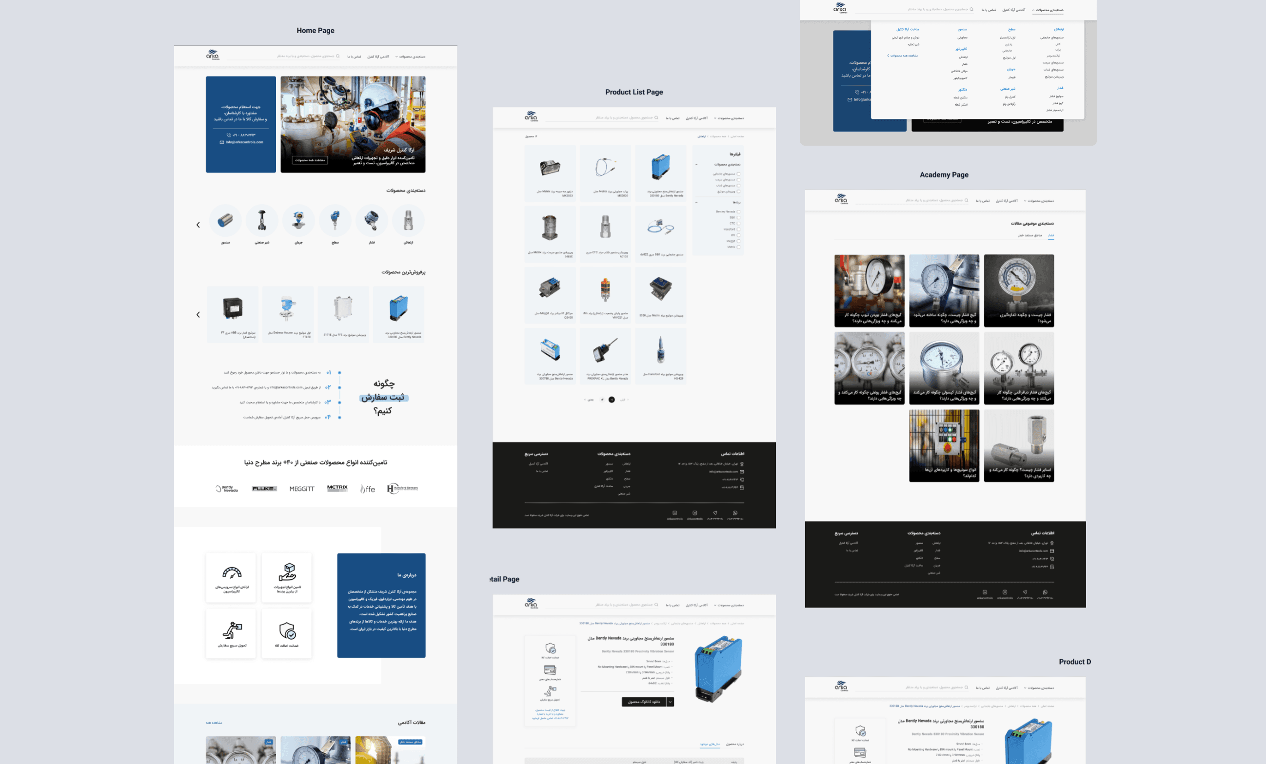


The project begins with an analysis of a control system environment where users interact with a large number of data points, actions, and operational controls. While the system is functionally rich, its structure creates friction in decision-making and slows down user workflows due to a lack of clarity and poor visual hierarchy.
The redesign process focused on identifying the core usability issues: fragmented navigation patterns, overloaded screens, inconsistent interaction behaviors, and difficulty quickly scanning critical information. These issues were not just visual problems, but structural UX challenges affecting how users understood and controlled the system.
To address this, the information architecture was reorganized to prioritize clarity and task flow. Interfaces were redesigned with a stronger emphasis on hierarchy, grouping related actions, and reducing unnecessary visual noise. Repeated patterns were introduced to make interactions more predictable and reduce the learning curve for new users.
Special attention was given to the decision-making flow inside the system. Instead of forcing users to interpret multiple layers of information at once, the redesign guides attention through structured sections, allowing users to focus on one decision at a time. This reduced cognitive overload and improved the overall speed of interaction.
The visual design supports this restructuring by using spacing, contrast, and alignment to create clear separation between functional areas. The goal was not to oversimplify the system, but to make complexity manageable—keeping advanced functionality intact while improving accessibility and usability.
The final result is a more coherent and structured control experience where users can navigate, interpret, and act on information with significantly less friction. The system becomes easier to learn, faster to use, and more reliable in high-pressure operational contexts.