Role
AI Product Designer
Company
Independent Project
Year
2026
Panto Vaje a word-guessing and charades party game — from initial concept to launch on Iranian app stores

Building a complete game without professional coding knowledge
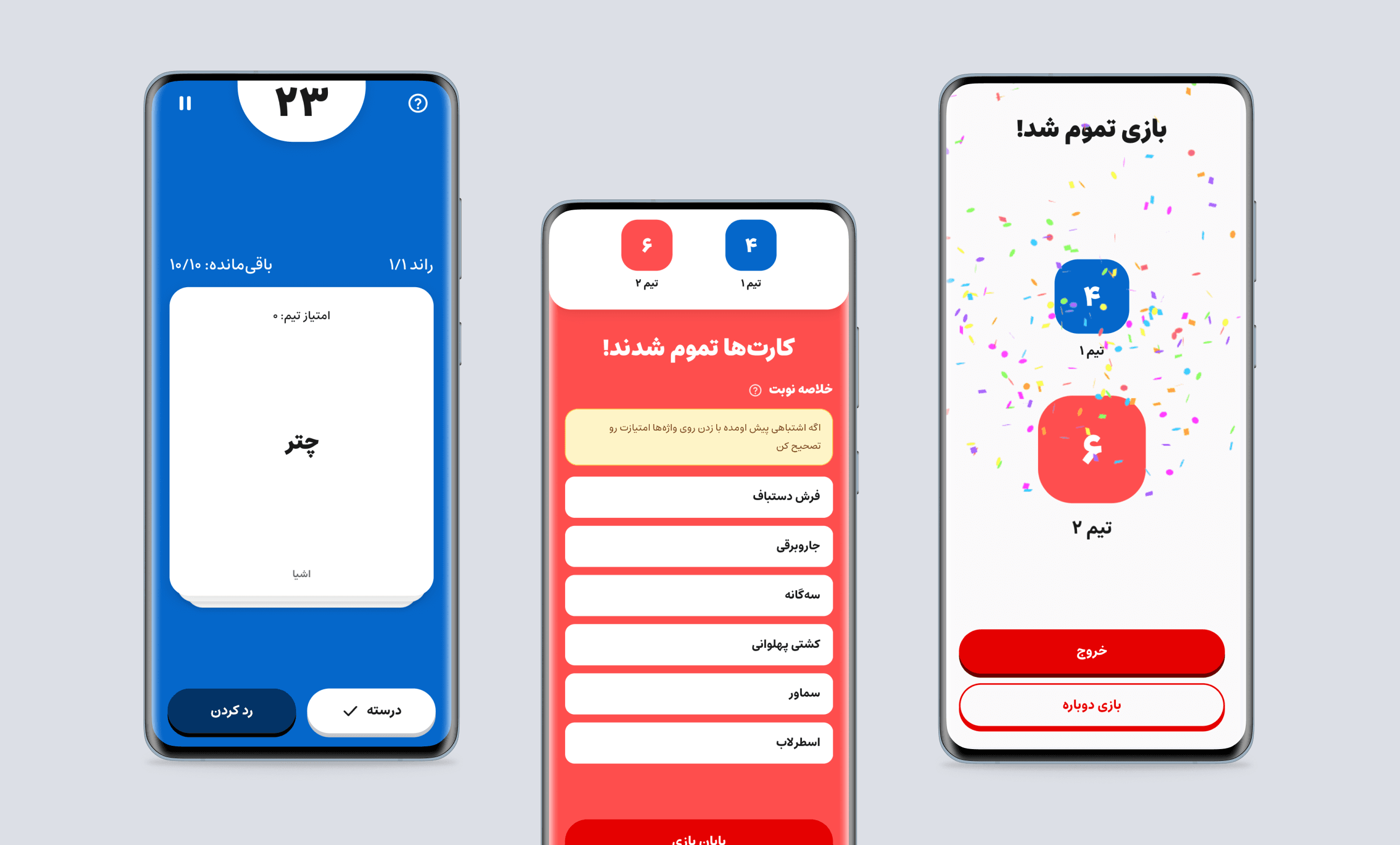
Panto Vaje is a word-guessing party game built end to end with AI guiding the technical execution — from initial concept to launch on Cafe Bazaar and Myket. My role as Product Designer covered all product decisions, design, and full technical direction through AI tools, without professional coding knowledge.


Summary
Designed and built a game — from initial idea to an installable mobile app — without professional coding knowledge, with AI fully guiding technical execution
Nearly 2,000 Persian game cards across 8 categories, written in a simple, warm tone suited to a Persian-speaking audience
2 rounds of usability testing (8 and 10 participants) that directly led to a complete redesign of the in-app guide/onboarding section
Careful documentation of every decision, including decisions that were later changed or abandoned
A complete application, live on Cafe Bazaar and Myket, with a PWA version
Context
Word-guessing party games (like Monikers) are popular worldwide, but no Persian-language version existed that fit the spirit of Iranian friend and family gatherings. Panto Vaje was built to fill that gap.
From the start, accessibility for Iranian users was a serious concern. For this reason, contrary to common practice, the project's final infrastructure (the website and the PWA) was hosted on a domestic (Iranian) provider instead of international hosting services, to ensure the app would remain reliably accessible to users inside Iran.
The project's core constraint was clear from day one: building this application required technical knowledge that wasn't available. The decision was made to address this constraint by using AI tools.
Constraint → Approach
The project's main constraint was the lack of professional coding knowledge. Building a complete application — from UI design to technical architecture, Android build, and release preparation — normally requires a development team.
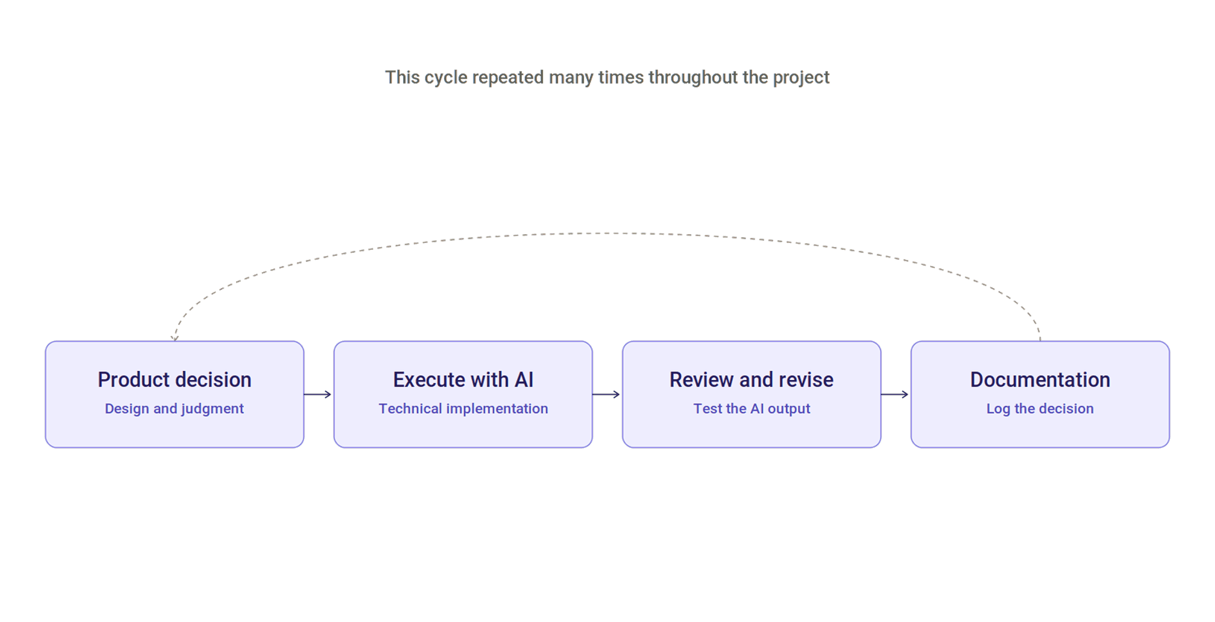
Rather than spending a long time learning professional coding or hiring a technical team, the chosen approach was to use AI tools as the execution layer. Roles were divided as follows: product decisions, design, and final judgment were mine; technical execution (writing code, implementation, bug fixing) was carried out through AI tools under my direct direction.
This approach operated as a repeating cycle throughout the project: I would make a product decision, hand it off to an AI tool for execution, review and revise the result against design and UX standards, and the cycle would continue.
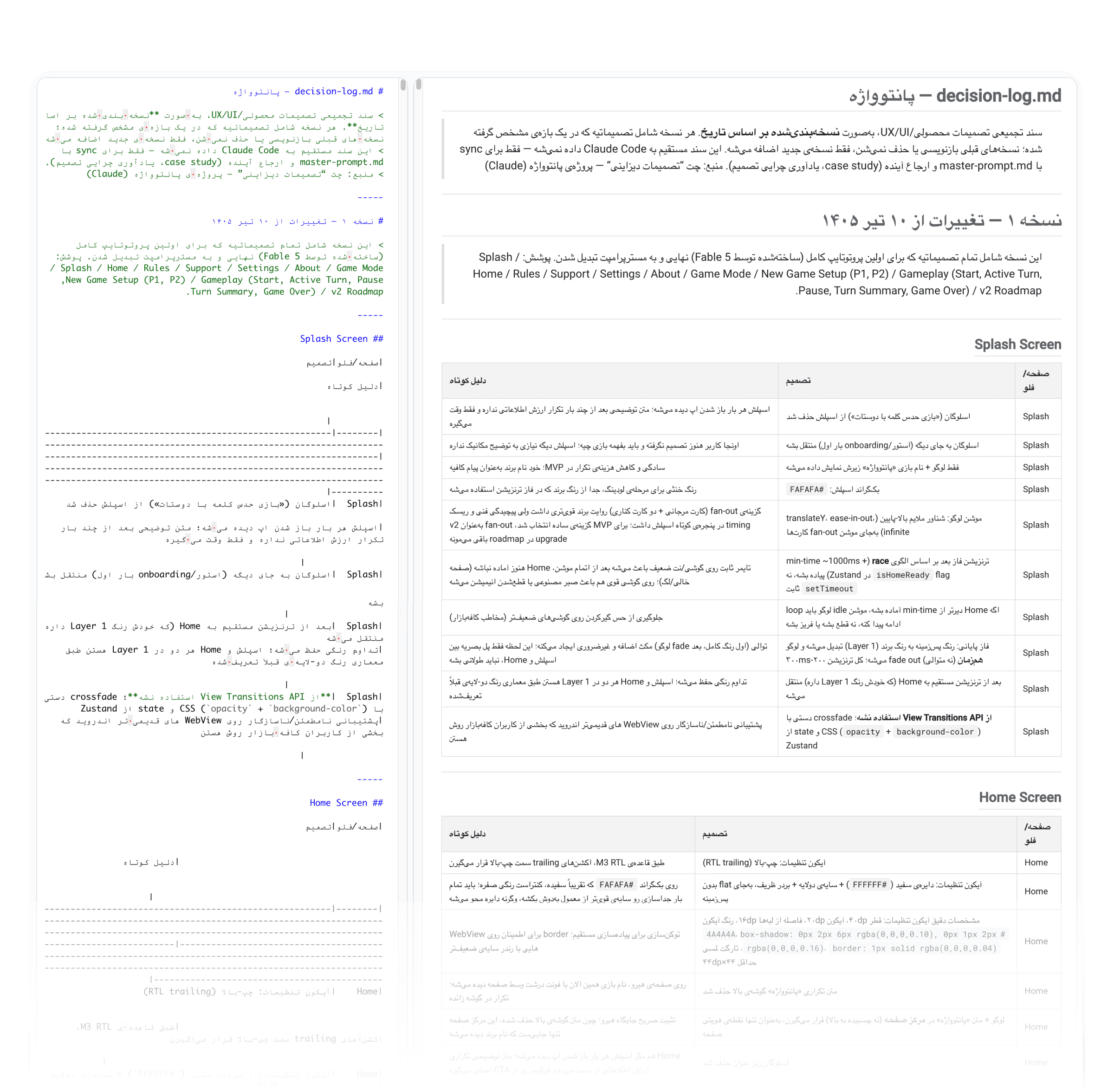
To keep everything fully documented — and so the project could be handed off to a different AI tool or session with minimal friction if needed — two core documents were maintained: a decision log that recorded every decision and its rationale, and a self-contained reference prompt (master prompt) that captured the entire project specification — detailed enough that even an AI tool with no prior history of the project could pick it up and continue correctly from that document alone.
Product / Solution
Core game mechanic
Panto Vaje is a local, offline party game (no internet required) in which teams guess the word on a card. The game runs across three rounds of increasing difficulty:
Round 1: Free description
Round 2: One word only
Round 3: Charades only
A shared deck of cards is used across all three rounds, so each round is naturally harder than the last, since words already seen can no longer be described as simply.
Key decisions that shaped the game
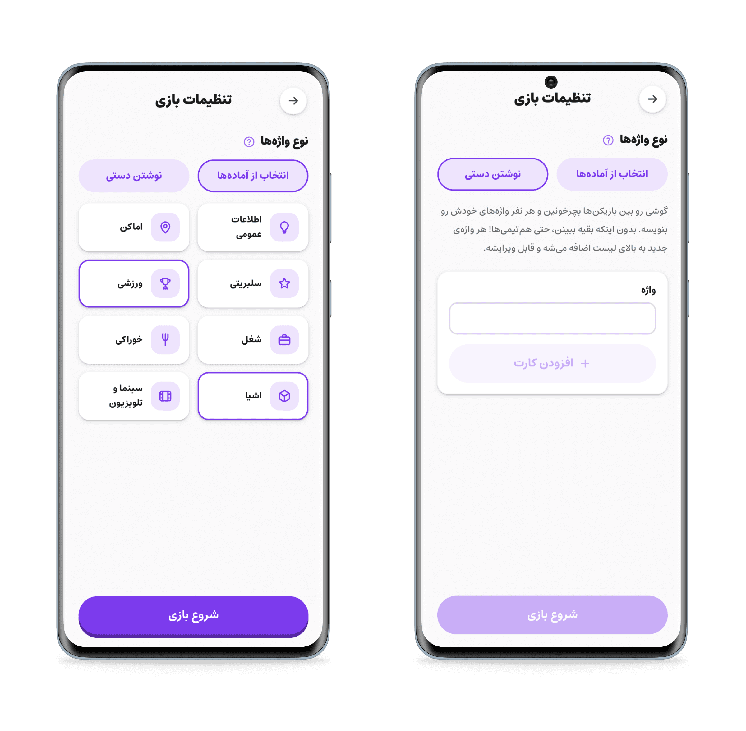
From three modes to two. The game originally had three modes: Classic, Chill, and Custom. After review and testing, the Chill mode was fully removed and set aside for future versions; the final version has two modes: Classic (quick start, no setup) and Custom (lets players set round count, round duration, and a skip penalty).
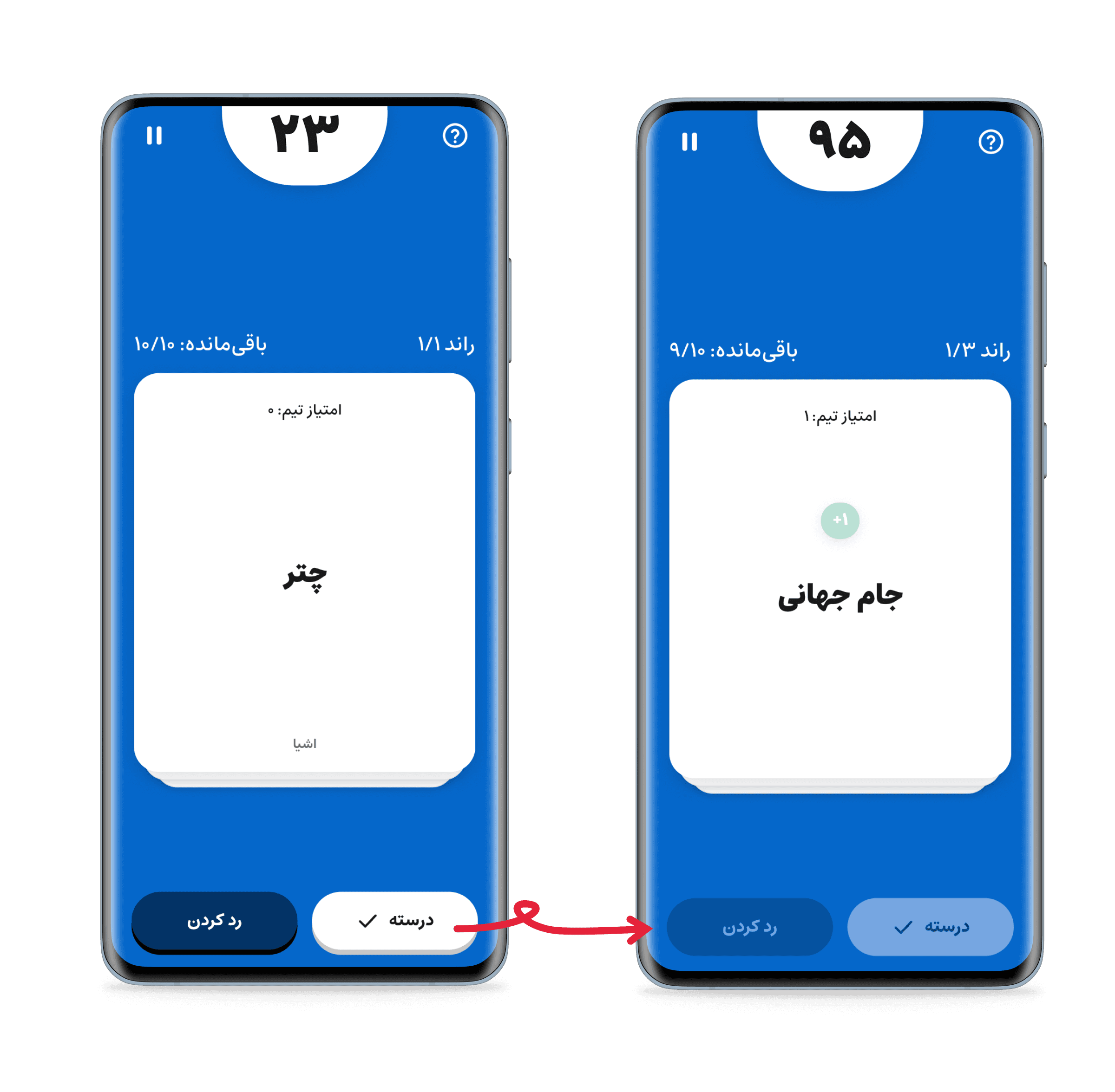
Simplifying the scoring system. In early versions, each card was worth a different number of points based on difficulty. This system confused usability testing and was replaced by a simpler system in which every card is worth one point.
Content across eight categories. Nearly 2,000 cards were written across categories such as general knowledge, celebrities, jobs, places, and film & TV — with the constraint that every category had to work across all three rounds, including the charades round. It was also decided early on that, across multiple games, the same card should not be shown to the same user.
Systematic accessibility standards. To ensure text readability across a wide range of background colors (team colors, mode colors), a fixed rule was defined: text color is automatically determined based on background lightness, so that WCAG contrast standards are always met. This rule was applied everywhere in the game where the background color varies.
Process
Usability testing methodology
Before design decisions were finalized, a specific usability testing approach was used: instead of remote screen-sharing, a real link to the game was sent to each participant so they could try it on their own phone; participants were asked to think aloud while completing each task; and instead of open-ended requests, a few specific tasks were defined (such as starting a Classic-mode game with two teams).
2 real rounds of testing were run:
Round one with eight participants, which surfaced problems in understanding scoring and recognizing transitions between turns and rounds
Round two with ten participants, after initial fixes, where remaining problems were mostly concentrated in the in-app guide (onboarding)
Findings from round two directly led to a complete redesign of the in-app guide.

Examples of prioritization
Throughout the project, some decisions were consciously set aside or later reversed:
Normally, adding new cards to the game requires building and re-releasing a new version of the app through Cafe Bazaar and Myket — a slow process. An idea was proposed to let new cards appear directly to users without going through that re-release process. This idea was reviewed and consciously set aside for this stage of the project, since it required additional server infrastructure that wasn't immediately valuable for the current version.
Another mechanic was considered: before the game starts, each player would see a set of cards and set aside any they felt their group wouldn't recognize; the remaining cards from all players would be combined into the final deck. The goal was to let each group tailor the deck to what they were actually familiar with. This mechanic was judged genuinely valuable for Panto Vaje, but since the game runs on a single shared phone (not one device per player), implementing it required an entirely new UI flow. For that reason, this idea was set aside for this stage of the project.
Early on, it was decided that real payment gateway integration had to be completed before the first release. This decision was later fully reversed: the payment and donation feature was completely removed from this stage of the project so the release could happen faster. The related code wasn't deleted — it was kept in place for a future stage.
Collaboration / Execution — Working with AI
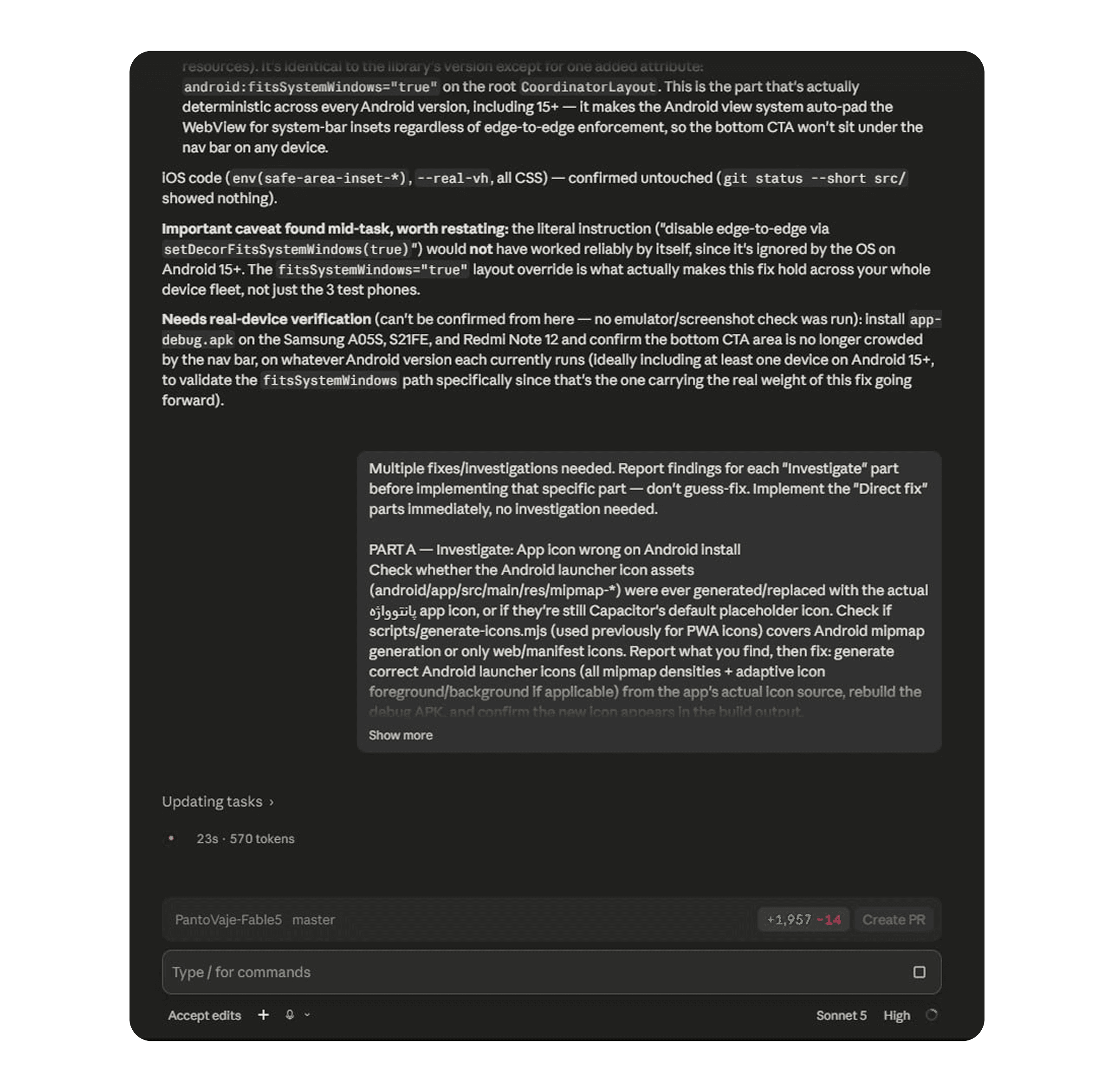
Different tools were used for different kinds of work throughout the project. Fable 5 was used to build the first demo version (prototype). As the project progressed, tasks that required deep review and evaluation (such as analyzing the codebase's architecture or designing multiple variants of a screen) were handled with the Opus model; well-defined, repetitive tasks (such as applying a specific fix or resolving a known bug) were handled with the Sonnet model. Technical implementation itself was carried out through Claude Code. This division was a deliberate decision made based on the nature of each task.
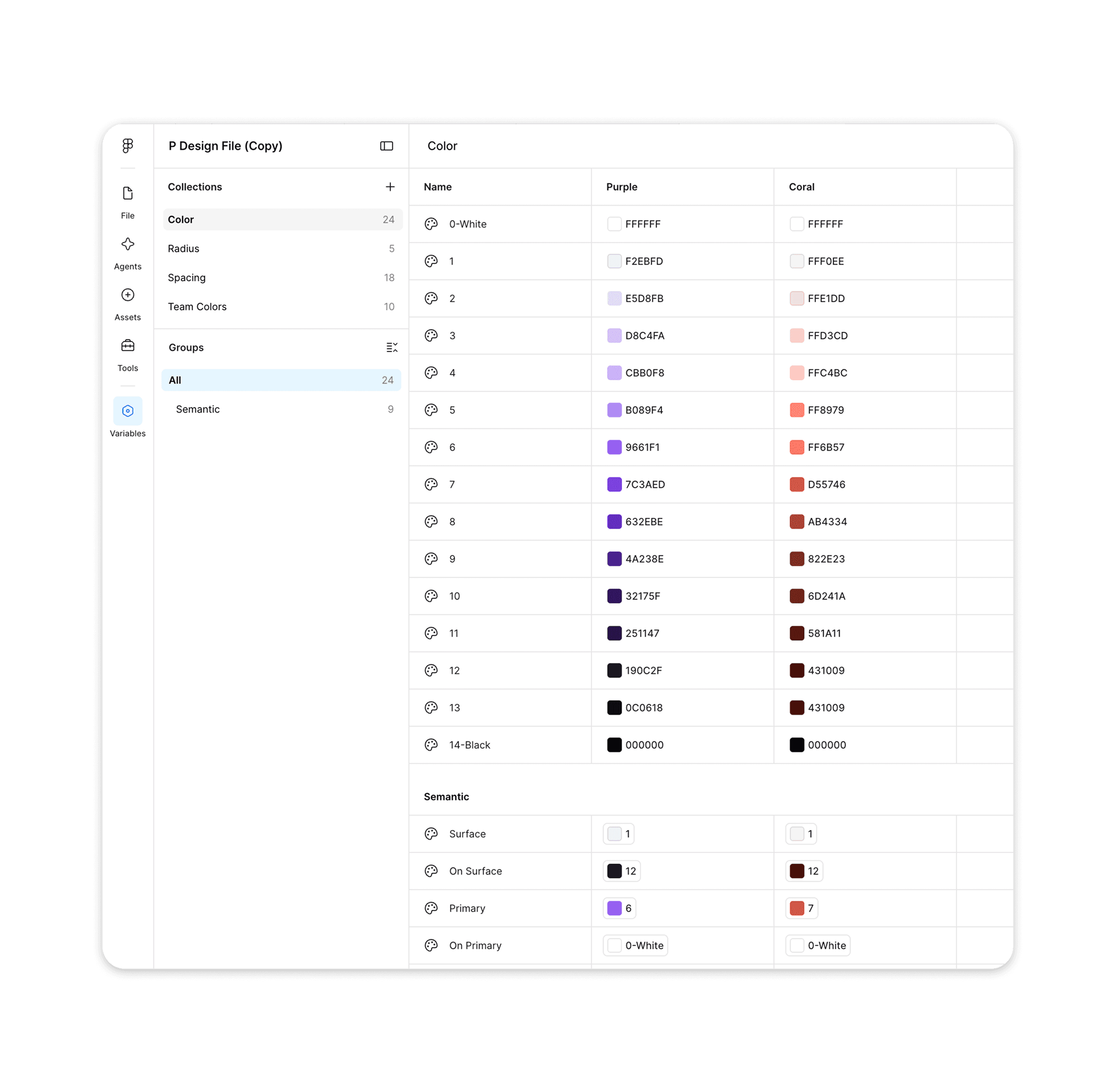
Alongside these tools, Figma was used to build the component library and precisely define design tokens (color, typography, spacing) to keep visual consistency between design and final implementation.
Documentation as working infrastructure
The project's decision log was maintained over time as a versioned document; any new decision that changed a previous one was recorded separately, with an explicit reference back to the earlier decision, rather than overwriting it. This structure helped ensure the full history of every decision — why it was made one way initially, and why it later changed — always remained accessible.
An example of evidence-based decision-making
At one point in the project, a decision had to be made about whether to refactor the existing codebase or rebuild it from scratch. Rather than asking this question in general terms, a structured evaluation was requested across several specific dimensions (state management health, component structure, technical debt, production readiness). The result was a documented report showing that the core of the codebase (state management) was well-designed and didn't need a full rewrite, while another part (styling) was unfinished and required completion. The final decision was made based on this evidence, not on assumption.
A pattern of comparing parallel variants
For design decisions with multiple possible solutions, instead of requesting a single solution and accepting it as-is, a repeatable method was used: several parallel versions of the same solution were built, each on its own separate route, isolated from the main app (so none of them affected the real user experience), then the versions were compared side by side and the best option was chosen. For example, to design the "no internet" error state in the payment section, three completely different approaches were built and compared; once the final choice was made, the rejected versions and their temporary routes were fully removed from the project, so no leftover code remained. This method was repeated for several other design decisions throughout the project and became a consistent working pattern.
Deep-Dive — Technical Challenges
Bug 1: Content misalignment in the installed iOS version
Symptom: In the installed, home-screen mode on iPhone (not in the browser), the app's content appeared compressed from the top with an empty bar at the bottom. This issue only appeared in that specific mode.
Hypotheses and early attempts: Several hypotheses were tested in sequence and ruled out: adjusting safe-area spacing, changing how scrolling was handled, and measuring screen height directly with code instead of relying on standard browser units. None of these fully resolved the issue.
Final approach: Instead of continuing to guess, a temporary diagnostic panel was added to the screen that displayed the real, live values related to screen size directly on the device. This revealed that a specific setting in the page's metadata was causing the screen to render in a smaller area than its actual size. Changing that single setting fully resolved the issue, confirmed on a real device.
Lesson: Some bugs can't be solved through repeated guessing; sometimes real data needs to be gathered directly from the device itself.
Bug 2: A similar problem on Android, with a different root cause
Symptom: After fixing the iOS bug, a similar issue (improper spacing at the top and bottom of the screen) appeared on Android too.
Investigation: The root cause on Android was a structural issue in how the screen's styling was written, which had existed in the code from before — but because the separate iOS fix had resolved a similar issue through a different path, this underlying issue had accidentally stayed hidden. On Android, without that other fix masking it, the real issue was fully exposed.
Final approach: Safe-area spacing was applied directly to the element itself, rather than to its parent.
Lesson: Sometimes the real cause of a problem lives somewhere different from where the problem shows itself.
Bug 3: The keyboard covering input fields
Symptom: On data-entry screens, when a user tapped a text field, the keyboard would open but cover that same field. This issue only appeared in the installed Android app; it worked correctly on the web version.
Investigation: On newer Android versions, a change in how the operating system manages screen layout meant that when the keyboard opened, the app's actual screen size wouldn't change — so the mechanism being used to detect "the keyboard opened" never activated.
Final approach: A dedicated plugin that receives the "keyboard opened" event directly from the Android operating system was used instead.
Lesson: Identical behavior across web and installed app isn't guaranteed, even with a shared codebase.
The font and accessibility issue
On some phones, the game's Persian font sometimes failed to render correctly. Investigation showed the font was being loaded from an external online service rather than bundled with the app itself — meaning that if the internet connection dropped, or if that service was filtered for an Iranian user, the system's fallback font would appear instead. This contradicted the core principle that "the game must work fully offline." The fix: the font files were bundled directly inside the app. This issue, alongside attention to color contrast and adequately sized touch targets, was part of a broader view of accessibility: both in the sense of the game being usable by everyone, and in the sense of being independent from factors outside the project's control, such as filtering or internet outages.
Outcome
Current status
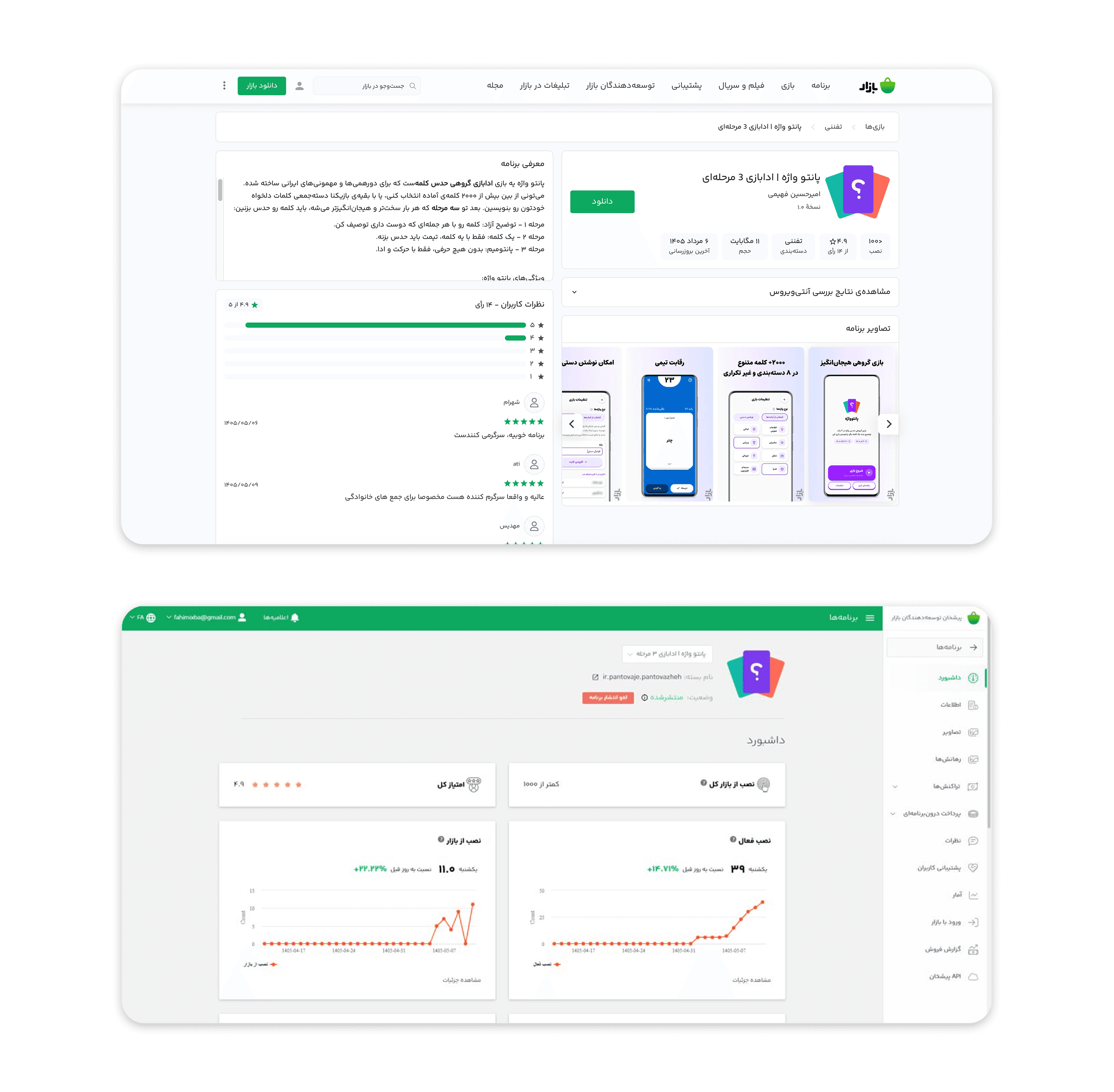
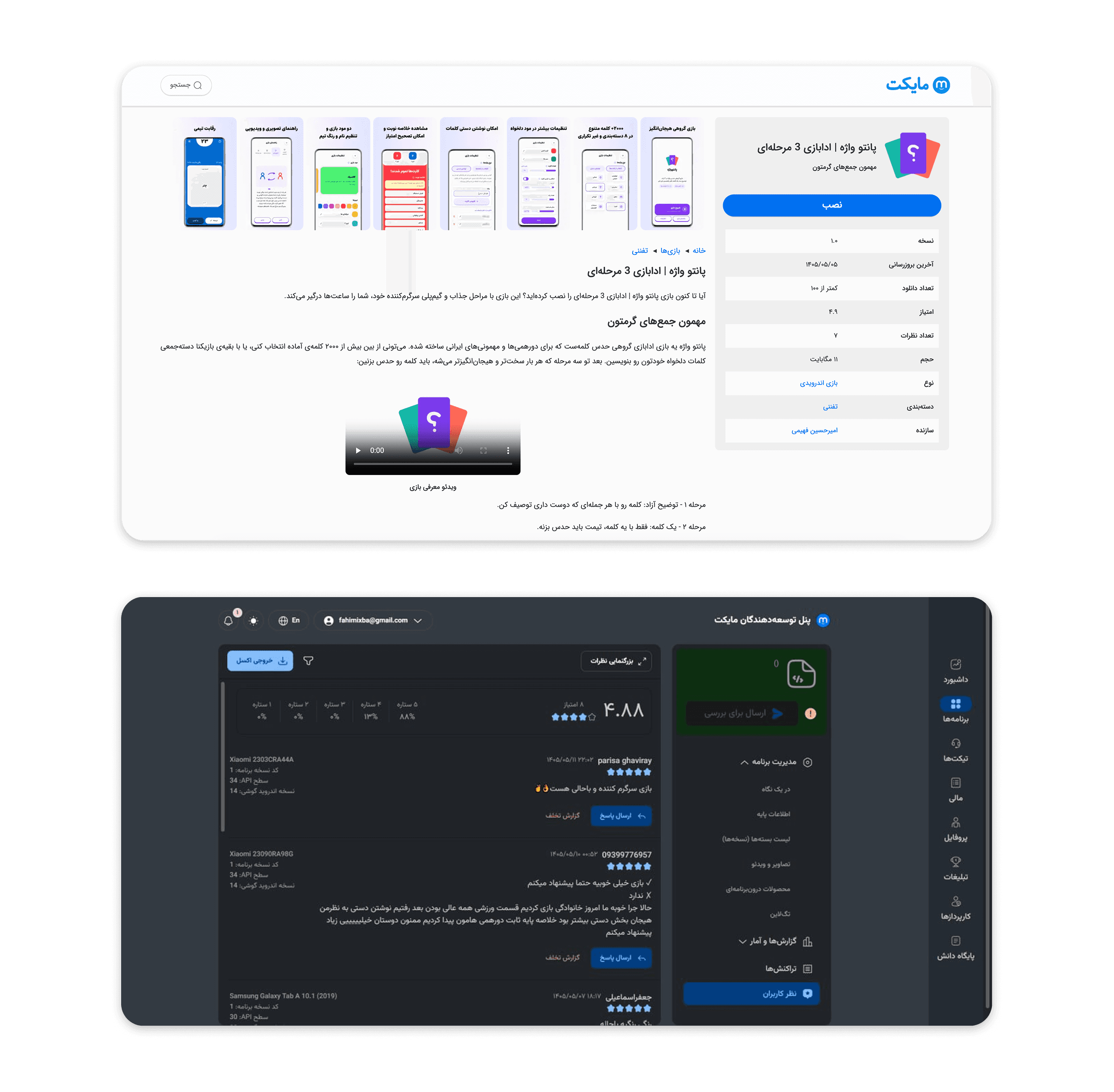
The project has officially launched. The PWA version is available at pantovaje.ir, and the Android app has been approved and published on Cafe Bazaar and Myket, and is currently available to users.
Project numbers
Nearly 2,000 game cards across 8 categories
2 full rounds of usability testing, 18 participants total
Over 30 distinct screens and states in the app, from the home screen to game over
Nearly 50 downloads on Cafe Bazaar and Myket so far (as of early Mordad 1405 / late July 2026)
Reflection
What I learned from this project
The most important lesson was the importance of careful documentation. In the early months of the project, decisions were made in a scattered way, and sometimes a previous decision was mistakenly questioned again or ignored, simply because there was no clear record of it. Once a proper documentation system (a decision log and a reference prompt) was established, this problem went away. If I were starting over, I would set up that system from day one, rather than after paying the cost of not having it a few times over.
The second lesson was the importance of not blindly accepting AI output. Several times throughout the project, a result that looked correct at first glance turned out, on closer inspection, to have an issue or to contradict an earlier decision. Being able to catch these cases and ask for a re-check was a core part of my role as the person responsible for final judgment.
Credits
This project was built in collaboration with Amirhosein Fahimi, as Co-Product Designer. We shared equal roles in product and design decision-making, and project direction was shaped jointly throughout.