Role
Product Designer
Company
Independent Case Study
Year
2026
Designing an AI-Powered Shopping Companion

Trust First, Intelligence Later: The Framework Behind a Behavioral AI Layer for E-commerce
A product design case study on building invisible AI into a grocery shopping experience - without the user ever knowing it's there.
The Problem Behind the Problem
My previous case study started with a clear question: “What should I cook tonight?” Iranian households — particularly those where one person manages grocery shopping for multiple family members — struggle with a fragmented experience. They search for recipes on one platform, buy ingredients on another, and often give up and order takeout. That case study was a design exploration of a unified platform connecting food discovery, recipes, and grocery ordering. It answered the question of what to cook.
But as I delved deeper into the research, a different problem surfaced — quieter, less obvious, and, in many ways, more expensive.
When you shop at a physical store, you carry your habits with you. You know you still have onions. You remember you’re almost out of rice. You have a feel for how much your household actually consumes in a week or a month.
Online carts don’t have that. They’re blank every time.
Research confirmed what I suspected. 38% of users reported buying more than they needed online. Nearly half said they weren’t sure how much to buy of any given item. And when I looked at multi-address users — people ordering groceries not just for themselves but for parents, siblings, or other relatives — the problem multiplied. Each address had its own patterns, its own rhythms, its own consumption habits. But the cart treated them all the same.
The insight that changed the direction of this project was simple:
The problem isn’t that users don’t know what to cook. The problem is that the cart doesn’t know them.
This shifted everything. Instead of layering another feature onto the experience, I started designing a behavioral AI layer that sits beneath the cart — invisible to the user, working in the background, learning over time.
Why Three Apps, One Layer
The context of this project is specific to the Iranian market, where three platforms dominate online grocery shopping: Snapp Market, Digikala Jet, and Okala. Each has millions of active users. Each has years of transaction data. And each already knows a great deal about how their users shop.
This is important because it removes one of the biggest risks in AI product design: the cold start problem. I didn’t need to design a data collection phase. The behavioral history already existed. What I needed was an intelligence layer that could sit atop any of these platforms and translate that history into real-time guidance within the cart.
One AI layer. Three different apps. The logic stays constant. The visual presentation adapts to each platform’s design system.
This distinction matters for product designers: you define the behavior once, when to show a message, what it should say, and when to stay silent. The engineering team at each platform maps that behavior to their own colors, typography, and component library. You don’t design three times. You design once, intelligently.
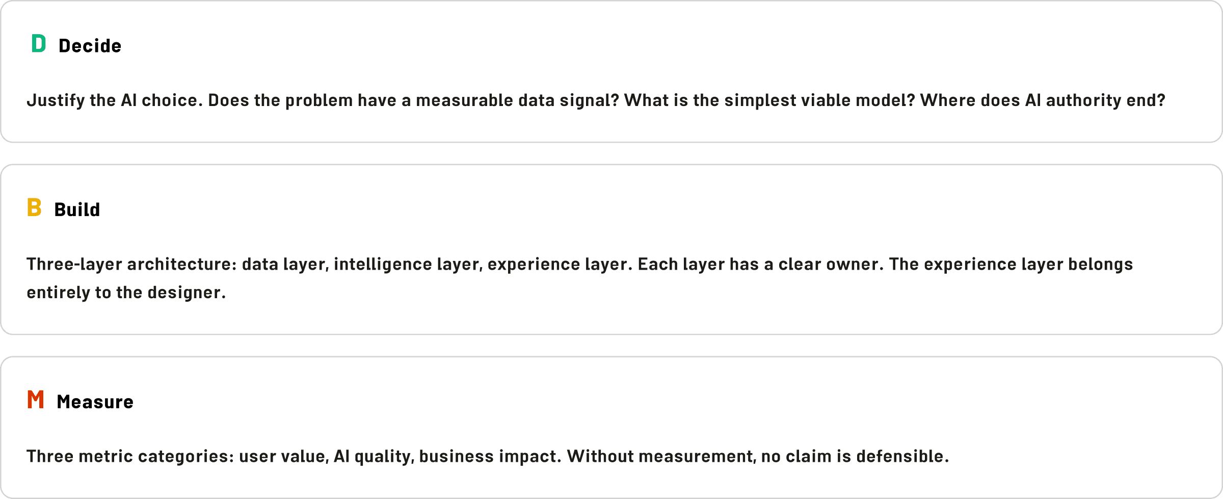
Before designing a single screen, I needed a framework that would keep every decision defensible. Not defensible in a bureaucratic sense — defensible in the sense that every design choice could answer three questions:
Why this AI? Could I solve this with a simpler rule? Does the problem actually have a measurable data signal? Where does the AI’s authority end and the user’s begin?
How will I build it? What does the data layer look like? What model do I use at each phase? What does the user actually see?
How will I know it worked? What does success look like — not in vanity metrics, but in behavioral change?
This became my DECIDE–BUILD–MEASURE framework. It’s not proprietary. It draws from established ideas: Occam’s Razor for the first layer, standard three-tier architecture for the second, and A/B testing methodology for the third. What it does is force every design decision through the same filter, so nothing is added because it’s clever or technically interesting. Things are added because they solve a real problem, at the right level of complexity, with a clear way to verify that they worked.
One rule runs through all three layers: AI proposes. The user decides. The cart never changes without permission. A suggestion is never a command.
The User Nobody Designed For
Before getting into the mechanics, it’s worth pausing on the user pattern that made this project interesting.
Imagine someone in their thirties, working, managing a household. On a given week, they might place three separate grocery orders: one for their own home, one for a parent across town, and one for a sibling or relative nearby.
Each of these orders is completely different. Their own cart is lean, weekly, and focused. The parents’ cart is monthly, larger, and heavier on staples. The relative buys every few days — small quantities, always fresh.
A single user account. Three behavioral profiles. Three different addresses. Three entirely different patterns of what counts as “normal.”
This pattern wasn’t rare. It showed up consistently across the research. And it exposed a fundamental gap: every address is a person, not a location. The AI needed to treat each one as a separate profile — building its own model of that household’s shopping behavior, independently of the others.
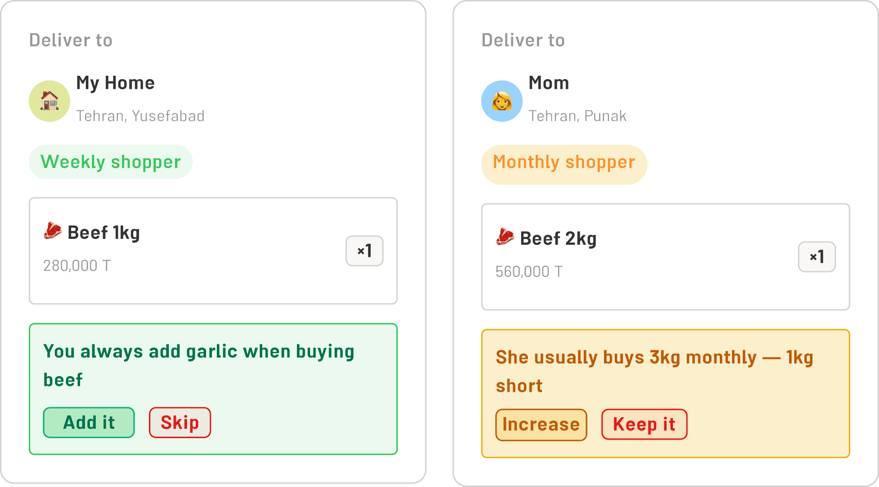
Confusing them would be worse than having no AI at all. This became one of the core architectural principles of the entire layer.
What the AI Actually Does
The behavioral layer I designed operates across four detection categories. In Phase 1 — which runs on rule-based logic, no machine learning required — three of these categories are active from day one:
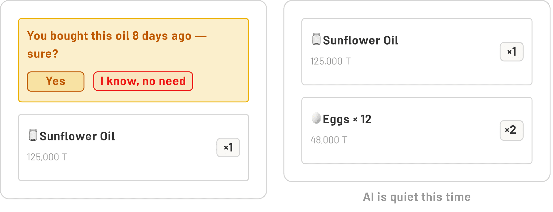
Repetition and timing. Did the user buy this item eight days ago, when they normally buy it every thirty? Did they forget something they reliably buy every two weeks? The AI knows the rhythm of each address. It notices when the rhythm breaks.
Quantity anomalies. This user typically buys one kilogram of ground beef. Today, there are three in the cart. That could mean a dinner party — or it could mean a mistake. The AI surfaces the discrepancy without making assumptions.
Co-occurrence gaps. In nine out of ten past orders, when this user bought cooking oil, they also bought tomato paste. Today, the cart has oil but no paste. A quiet note: “You usually add tomato paste when you buy oil — want me to add it?”
Cheaper alternatives. If a nearly identical product at a lower price point and equal or better rating exists, the AI mentions it. Once. Without pressure.
Phase 2 — which requires sufficient historical data and proper ML models — adds personalization, anomaly detection across multiple dimensions, and eventually a natural language interface for commands like “build my mother’s monthly cart.”
The critical design decision across all of this: The AI only speaks when it’s confident. There’s a threshold for each message type. Below that threshold, silence. A wrong suggestion damages trust faster than no suggestion at all.
Trust is Built One Suggestion at a Time
The trust model deserves its own section because it’s where most AI product features fail.
They launch too loudly. They over-suggest. They show up in the first session with confident recommendations based on no real data. Users dismiss them. After a few dismissals, they stop looking. The feature becomes noise.
I designed against this with what I called the trust ladder.

Purchases 1–5: Complete silence. The AI watches. It learns. It builds a profile. The user has no idea this is happening. There’s no onboarding tooltip, no “AI is learning your preferences” message, no indication of any kind. Just a cart that works normally.
Purchase 6: First contact. The AI makes its first suggestion — and it must be the lowest-risk suggestion available
le. Not “you’re buying too much meat.” Something like: “You forgot tomato paste — you usually grab it with the oil.” Easy to act on. Easy to dismiss. Low stakes either way.
At this first moment, a single tooltip appears — one time, never again:
“These suggestions are based on your last 5 purchases at this address. The more you shop, the better they get.”
Purchases 7–10: Gradual expansion. If the user has accepted suggestions, the AI becomes slightly bolder. If they’ve dismissed them, it stays quiet.
Purchase 11 and beyond: Full personalization. The profile is rich enough to support all four detection categories, plus Delegation — the ability to ask the AI to build the entire cart on the user’s behalf.
The dismissal behavior is equally deliberate. When a user dismisses a suggestion, the message disappears without acknowledgment. No “okay, got it.” No confirmation. No apology. The cart returns to its normal state, and a small, quiet indicator appears: “AI is quiet this time.”
That’s it. The AI stays silent for the rest of that session. It tries again — differently — next time.
Three dismissals of the same type of suggestion, and that suggestion type is permanently muted for that user. Their preference is logged. It never comes back.
When AI Should Ask Questions
There’s a category of situations that doesn’t fit neatly into suggestions or silence. This is Escalation — when the AI encounters something it doesn’t understand well enough to handle alone.
The trigger might be a sudden, dramatic shift in cart contents. A user who always buys full-fat dairy is switching entirely to low-fat products in a single session. Or ten kilograms of meat in a cart that normally sees one. These aren’t necessarily wrong — they might mean a new diet, a family event, or a change in household size. But they’re unusual enough that the AI shouldn’t silently update its model.
Instead, it asks — once, simply, with an opt-out:
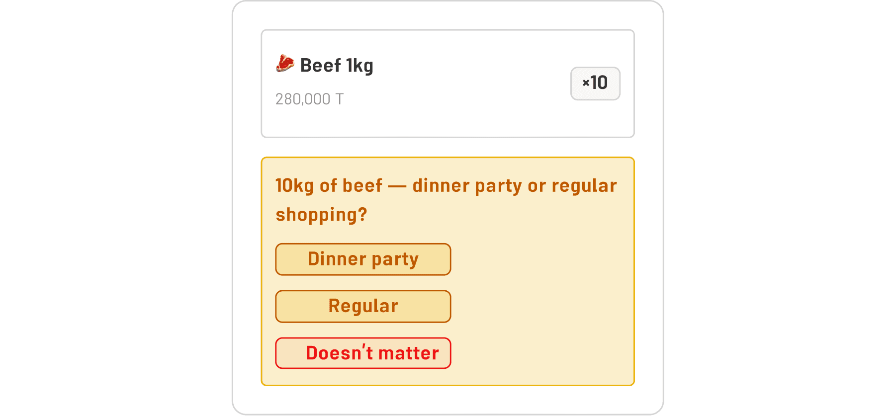
“10 kg of meat — is this for a party or a regular shop?”
Three options: Party. Regular. Doesn’t matter.
Whatever the answer, it informs the model. If the user selects “doesn’t matter,” the AI accepts that and moves on. The question isn’t an interrogation. It’s a brief moment of context-gathering that benefits both parties.
The harder form of escalation happens during Delegation. If the user asks the AI to build their mother’s monthly cart and one of the key items is out of stock, the AI doesn’t guess. It stops:
“I can’t complete this cart — the rice she always buys isn’t available. Want me to find a substitute, or would you prefer to choose?”
Two options. The user decides. The AI continues only with permission.
A note on changing preferences. Escalation also covers a subtler case: when a user’s taste genuinely shifts over time. Maybe they’ve discovered a new brand they prefer. Maybe they’ve switched from sunflower oil to olive oil over the past three purchases. The AI follows a simple rule here — one different purchase is an exception, two is a signal, three consecutive times is a new pattern. Only at three does the model update. And if the shift is sudden and sweeping — covering multiple product categories at once — the AI escalates rather than silently adapting. It asks once: “Your cart looks quite different from usual — is everything okay?” with a simple opt-out. This keeps the model honest without making users feel watched.
Delegation: The End of the Trust Ladder
At the top of the trust ladder is Delegation — the moment when a user says, in effect: “I trust you enough to do this for me.”
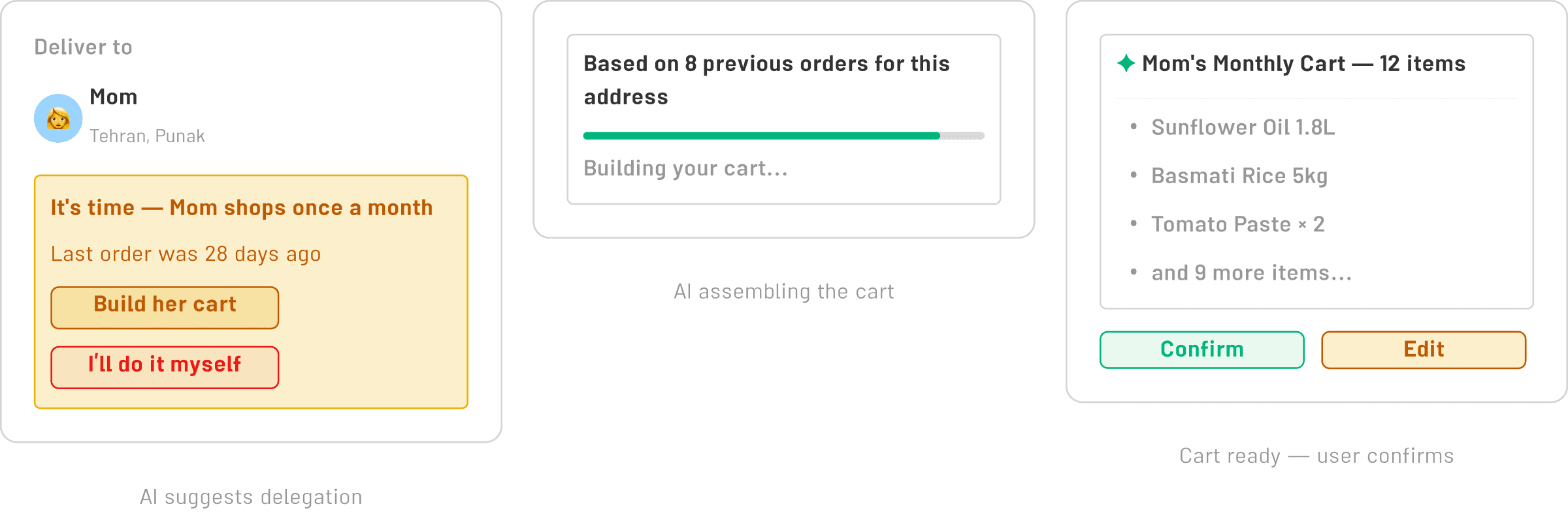
The design of this moment required more care than almost anything else in the project. Delegation is where the power asymmetry between AI and the user is most visible. If it goes wrong — if the cart that gets built doesn’t match expectations — the breach of trust is significant.
The rules I established:
Delegation only activates after a full profile has been built — a minimum of five purchases. The AI doesn’t offer to build the cart before it actually knows the user well enough to do it.
The built cart is always shown in full before confirmation. Nothing is hidden. Every item is visible. An edit button is always present.
Confirmation requires an explicit tap. Not “order placed.” Just “confirm and continue.” The final checkout remains a separate step.
And recurring Delegation — “build this cart every month” — is offered only after the first successful Delegation. It never runs automatically. Every recurrence requires a fresh confirmation tap.
This might seem overly cautious. It’s not. It’s the only way to maintain genuine user trust in a feature that, by definition, operates outside the user’s direct attention.
The One Thing That Matters Most
Everything in this system — the silence rules, the trust ladder, the Escalation logic, the Delegation guardrails — points toward a single design principle that proved more important than any technical decision:
The feature succeeds when the user doesn’t know it exists.
Not because I’m hiding something. But the best assistance is the kind that feels like competence, not intervention. The user who says “this app just works” and the user who says “this app has a really clever AI feature” are having very different product experiences. I wanted the first one.
That means the AI is never branded, never spotlit, never explained beyond a single tooltip on its first appearance. The suggestions don’t announce themselves as machine intelligence. They read like sensible observations — the kind a thoughtful friend who’d been watching your shopping habits for months might make.
That’s the bar. And it’s a higher bar than “the AI is accurate” or “the AI is fast.” It requires designing not just the moments when the AI speaks, but — more importantly — the moments when it doesn’t.
Three Lessons for Product Designers
If you’re building an AI layer into an existing product, here’s what this project taught us:

1. Start with silence, not suggestions. The instinct is to show the AI working as early as possible — to justify the investment, to demonstrate value, to keep stakeholders happy. Resist it. Five purchases of silence build more trust than five sessions of premature suggestions. A user who has never been wrong about what the AI knows about them is a user who will eventually trust it with something significant.
2. Design the failure states first. What happens when the AI is wrong? What happens when the server is slow? What happens when there’s no data? These aren’t edge cases — they’re the moments that define whether users trust the system or not. In this project, every failure mode was designed to be invisible. The cart works without the AI. The AI never produces an error message. Degraded performance looks exactly like normal performance.
3. The question of explainability is a design decision, not a technical one. Whether to show users why the AI made a suggestion is not something engineers can answer. It’s a product question. In this project, we showed a brief reason beneath each suggestion — “based on 9 of your last 10 purchases” — because transparency at that level builds trust without creating cognitive overhead. But the threshold for how much to explain is different for every product and every user base. Decide it deliberately. Don’t default to either extreme